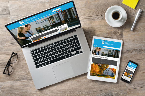
Responsive Design... or accepting that you can't control everything
Thursday, June 8, 2017
When we talk about Responsive Design, you have to admit (or be aware) that you can't control EVERYTHING that's displayed, unless you have a really large budget! It's possible to check on every type of device, but manufacturers regularly create a new one, with a new screen format or a new screen resolution (HD, ultraHD, 4K, etc.). So making sure everything is perfect EVERYWHERE takes alot of time! You'll have an almost infinite number of tests you can do, and we're not even talking about the type of technology (PC or Mac) or browser used (Firefox, Explorer (oops, he's dead), Chrome, Edge, etc.) Spend more time on the look of what's important than secondary information. (That's us! ;) ) Ask if you can preview the website on various devices while they're designing your website. Usual formats are tablets, desktop and mobile phones. These 3 formats will give you a pretty good idea of how your website will look. It's always possible to verify everything on lots of different screens and contexts, but be warned, you can only go as far as your budget allows you to!Accept that everything won't be perfect.
The solution? Good planning!
Prepare your content by keeping in mind what's important FOR YOUR CUSTOMERS.
Get help from specialists.
Ask to see the design